CARMIEL
2017 – 2018
150sqm
Collaboration with Disk – In Pro and Nadav Hazut
Photography: Aviad Bar Ness
THE CONCEPT OF A STRUCTURE WITHIN A STRUCTURE
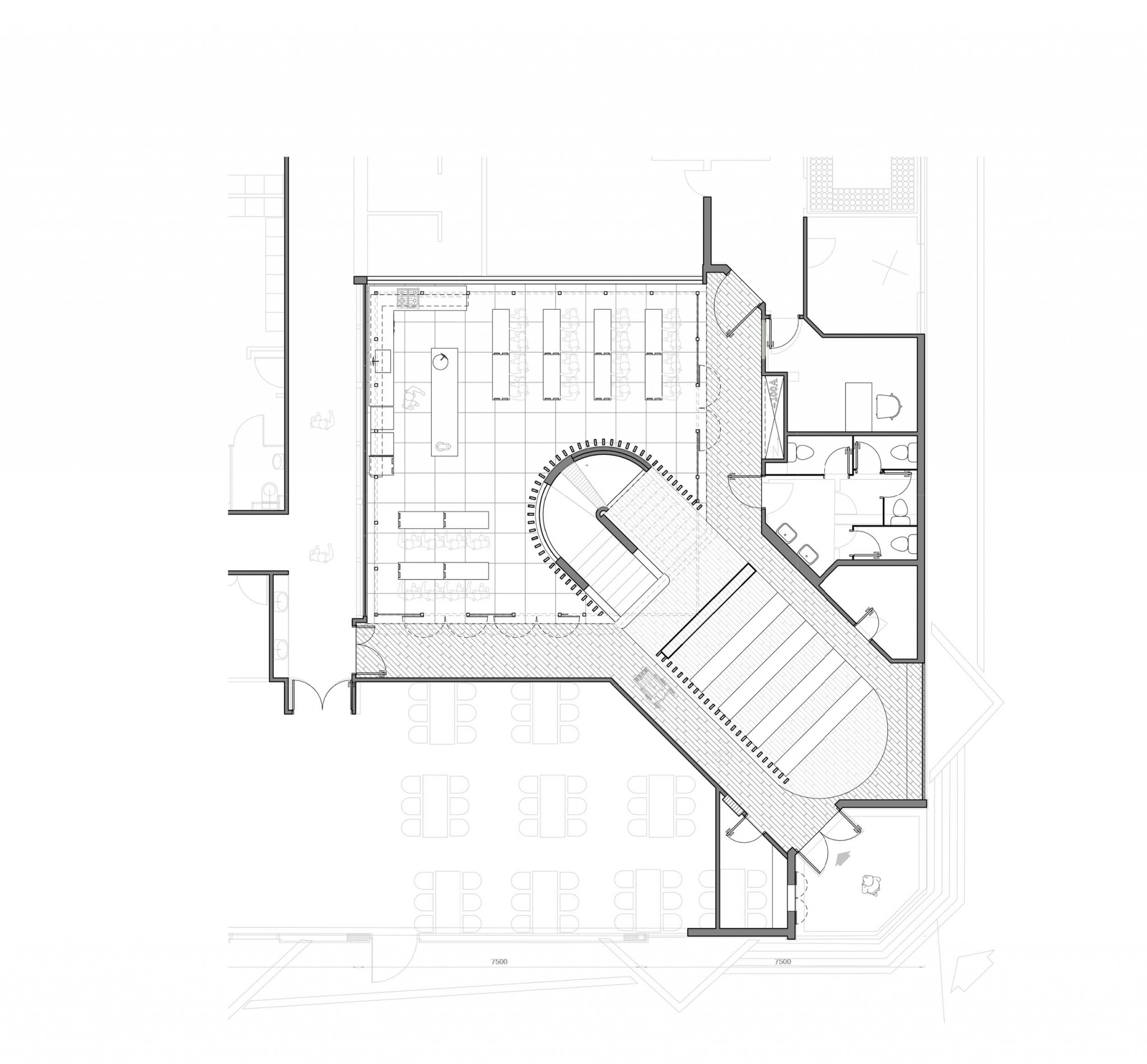
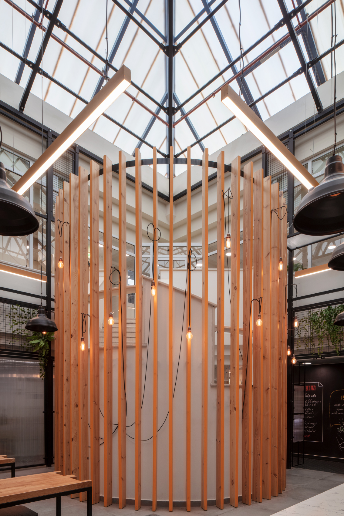
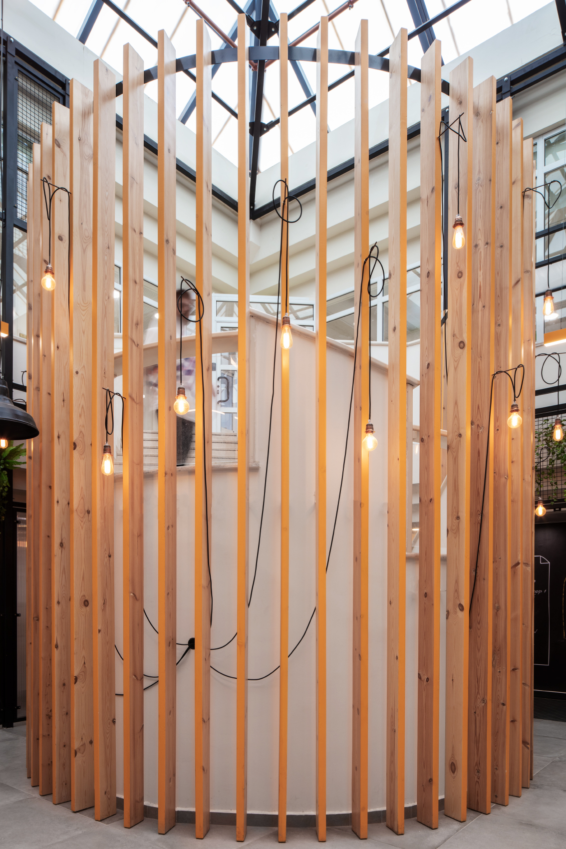
When we came for a preliminary tour of the building of the Strauss Salad factory in Carmiel, we were presented with a lobby, immediately followed by a kind of covered patio with a sloping glass roof that allows natural light to enter the enclosed space. Between these, we noticed an arched staircase connecting the entrance floor to the gallery floor where the factory offices are situated.
We were asked to develop a concept for transforming the place into a compact culinary center for visitors. They would be given an overview of the production process in the factory and then take part in preparing hummus under the guidance of a chef.
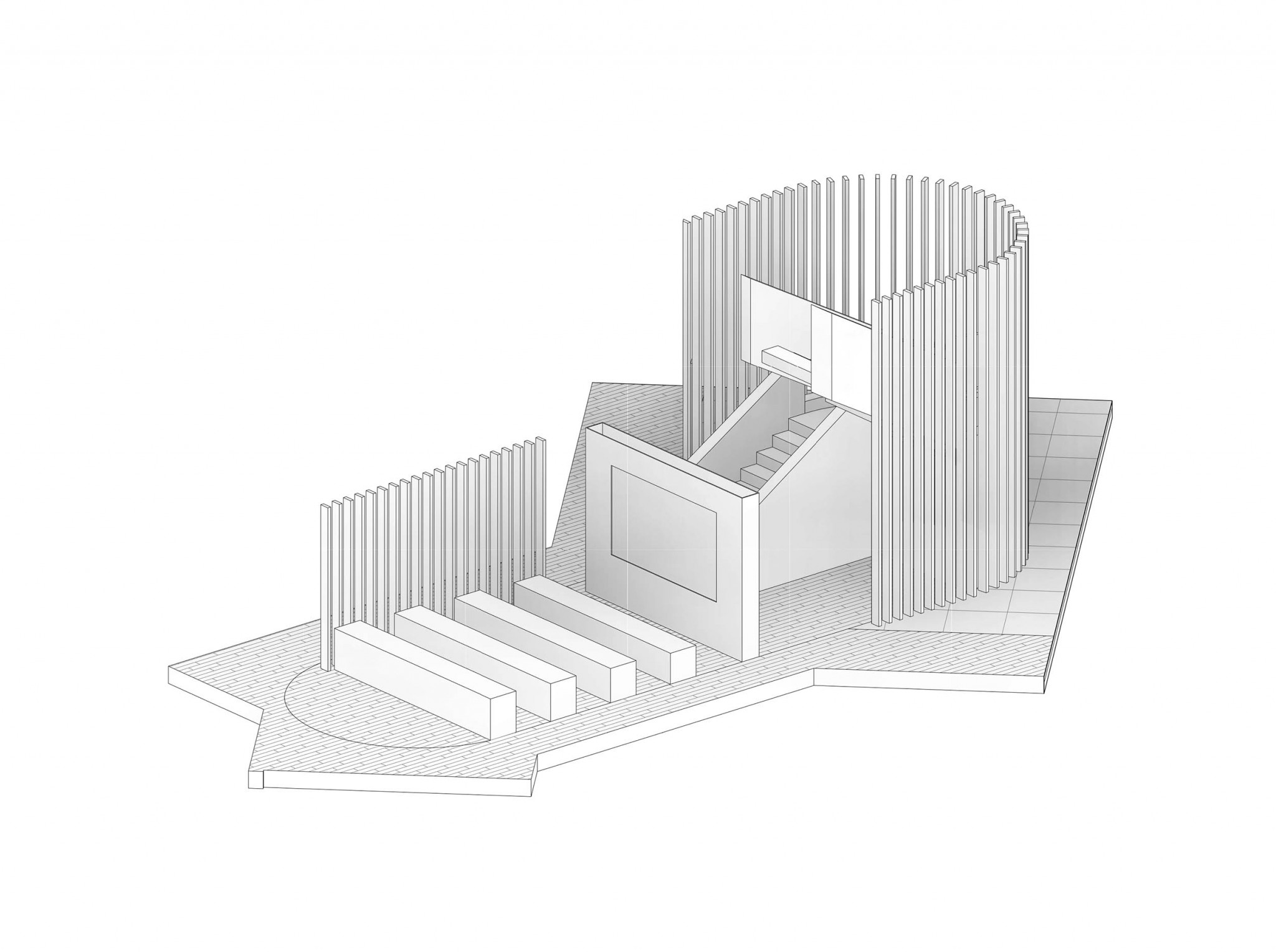
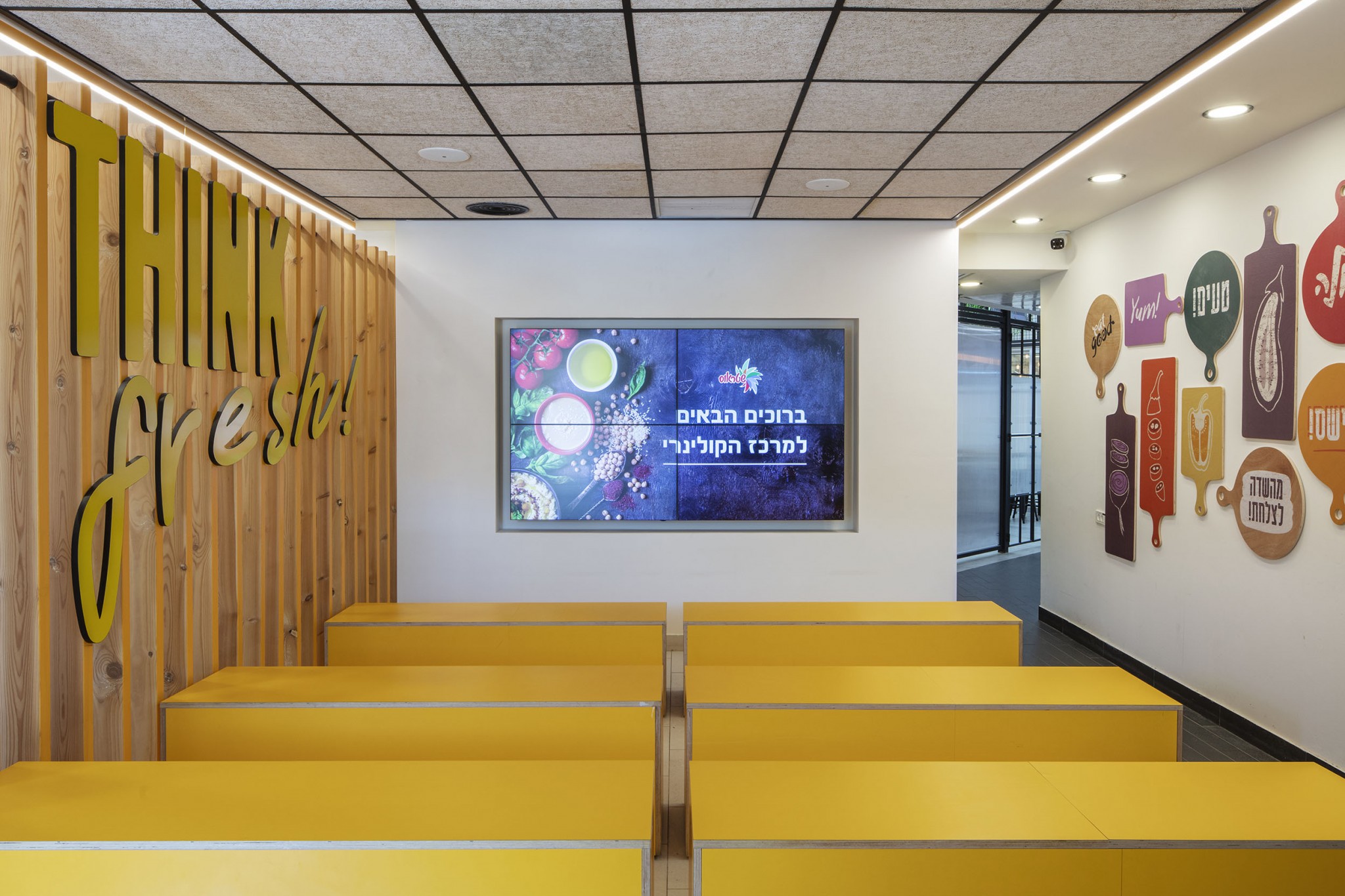
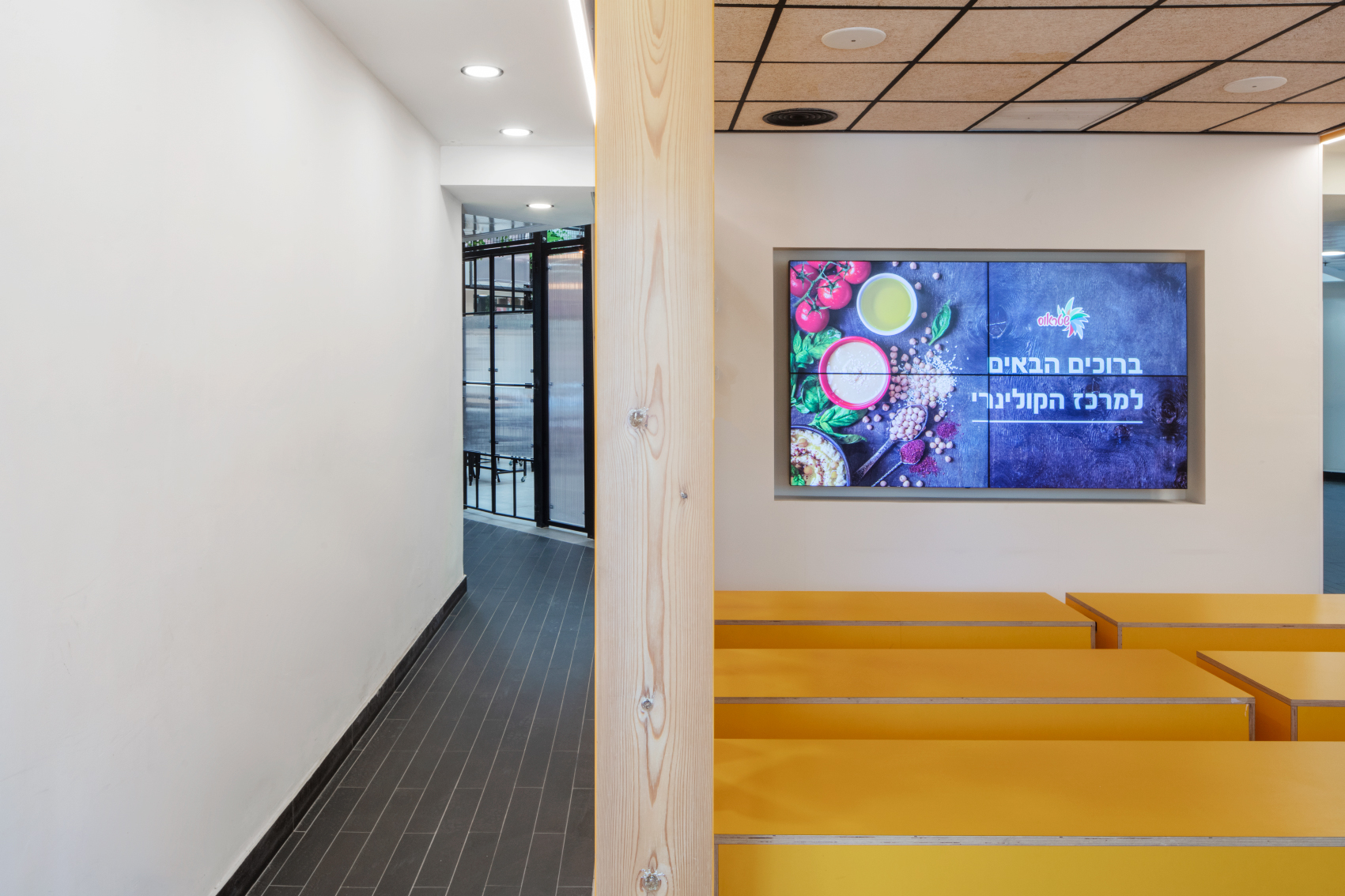
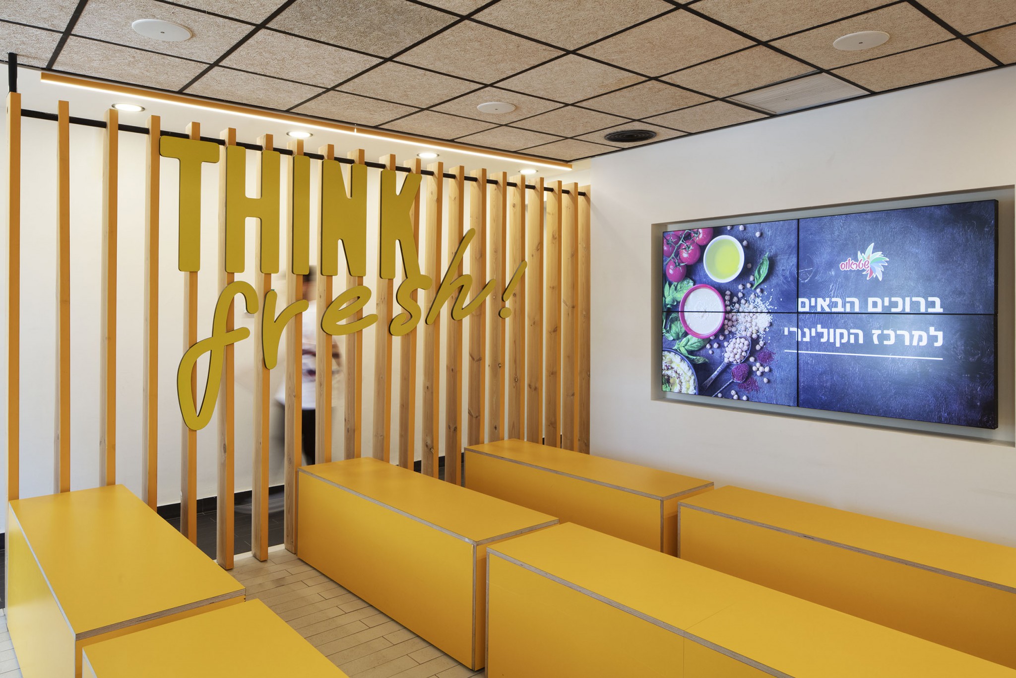
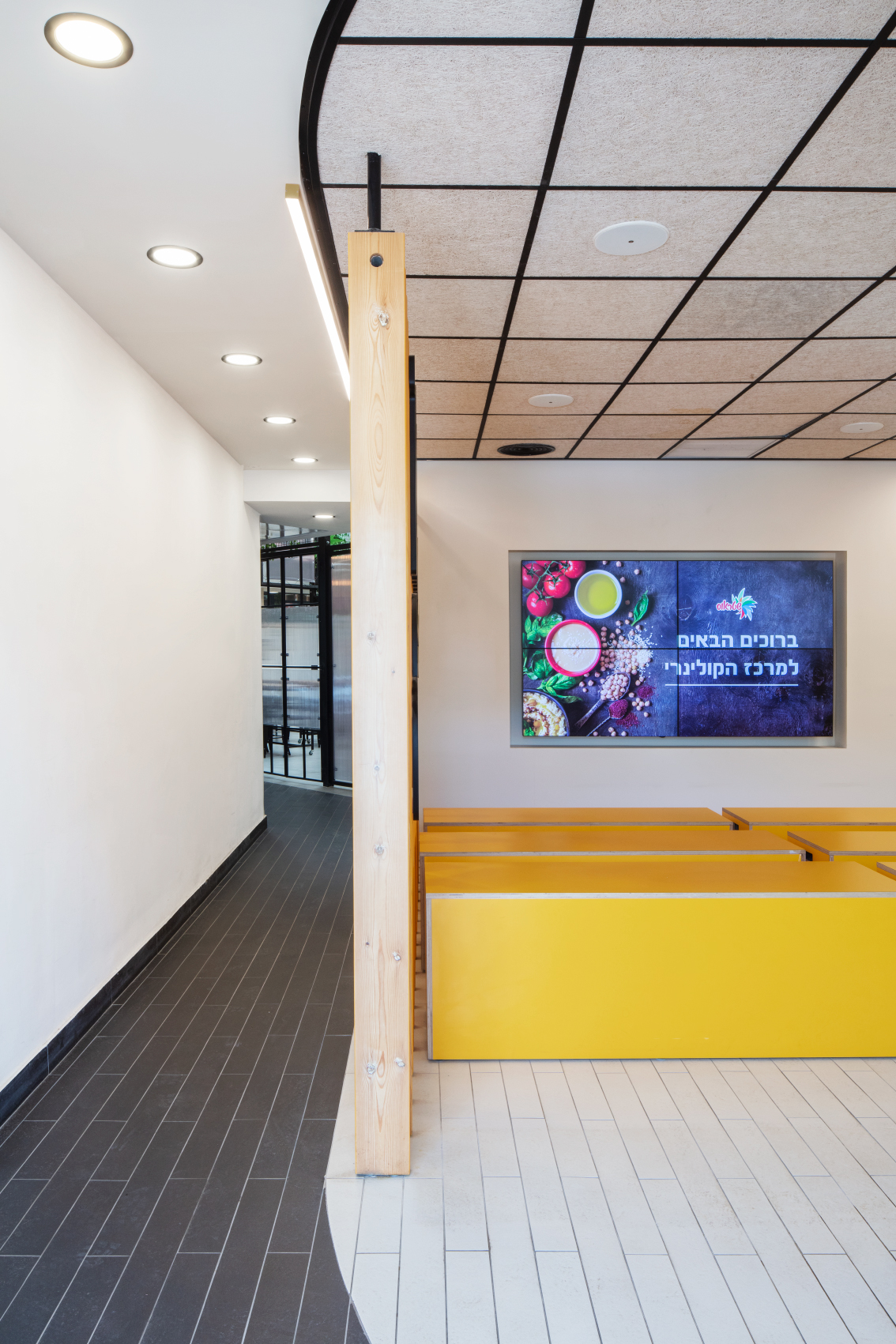
As the first act in planning, we divided the space into two parts in a clear geometric shape that follows the power lines of the structure. The first part is called a “capsule” which is created by a mirror effect of the arched staircase and constitutes the lobby where the visitors gather and receive an overview of what takes place in the culinary center. The second part is called ‘the greenhouse’, which is the hands-on part of the visitors’ activity. The two geometric structures are merged one into the other, as the capsule structure flows into the greenhouse space.
After the preliminary planning, we arranged the crowd flow design according to a plan that showedthe number of visitors to be accommodated.
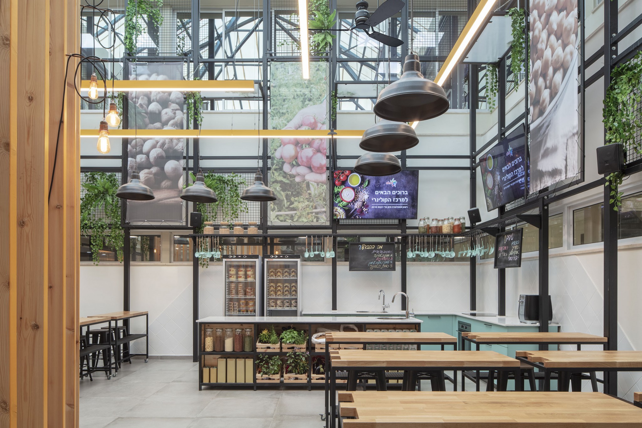
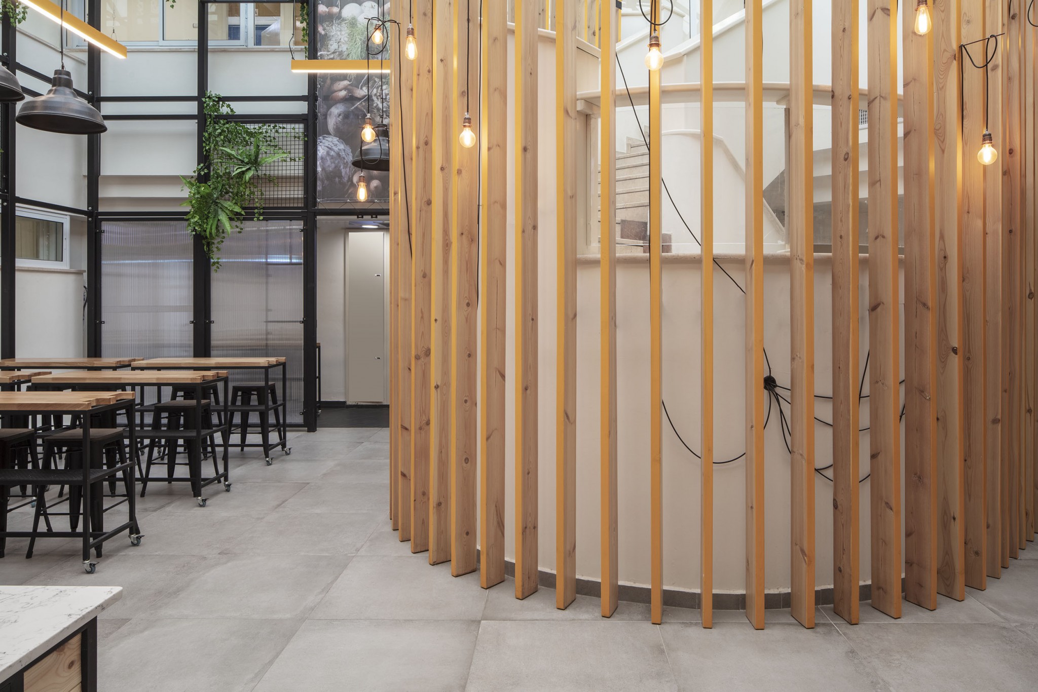
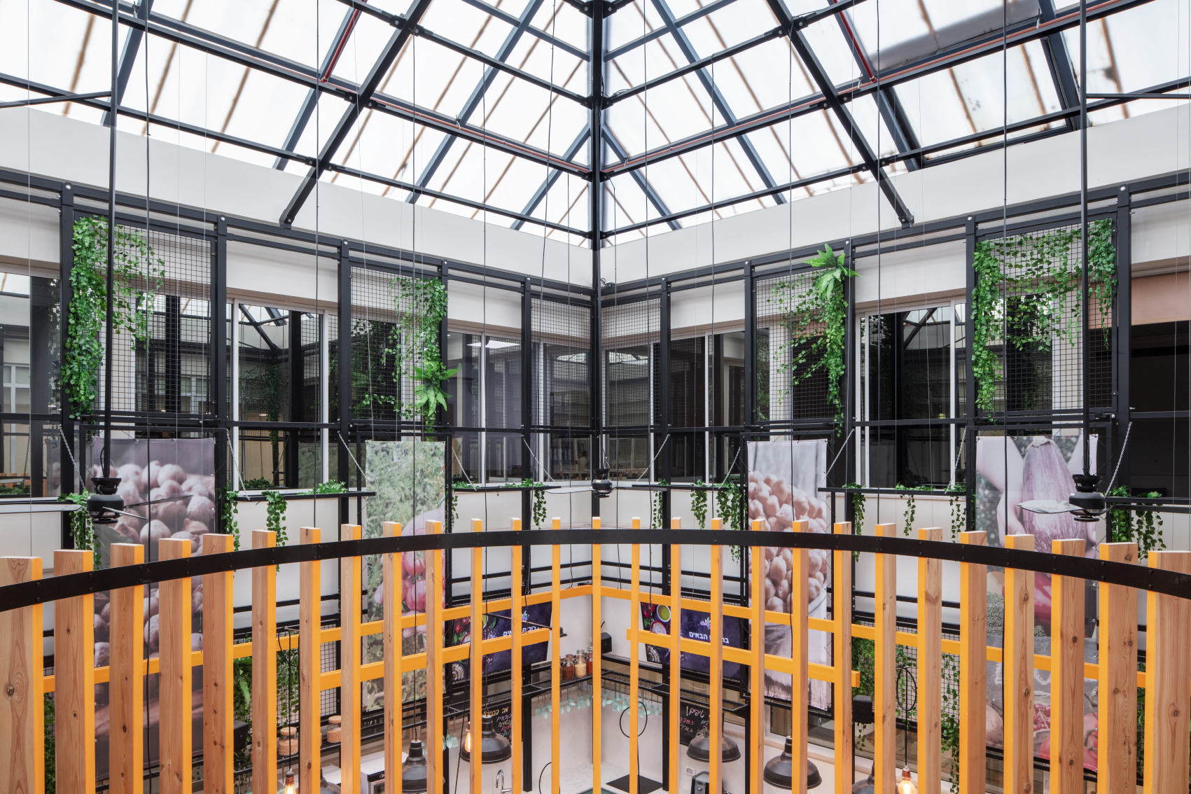
We planned and designed the character of each element of the center. The capsule was given a different floor and ceiling, while in the middle,wooden pine beams were placed withmolding painted yellow, inspired by the brand’s colors.The wooden beams form a barrier between the passage and the grandstand and continue into the greenhouse as they enclose the staircase to half the height of the greenhouse.
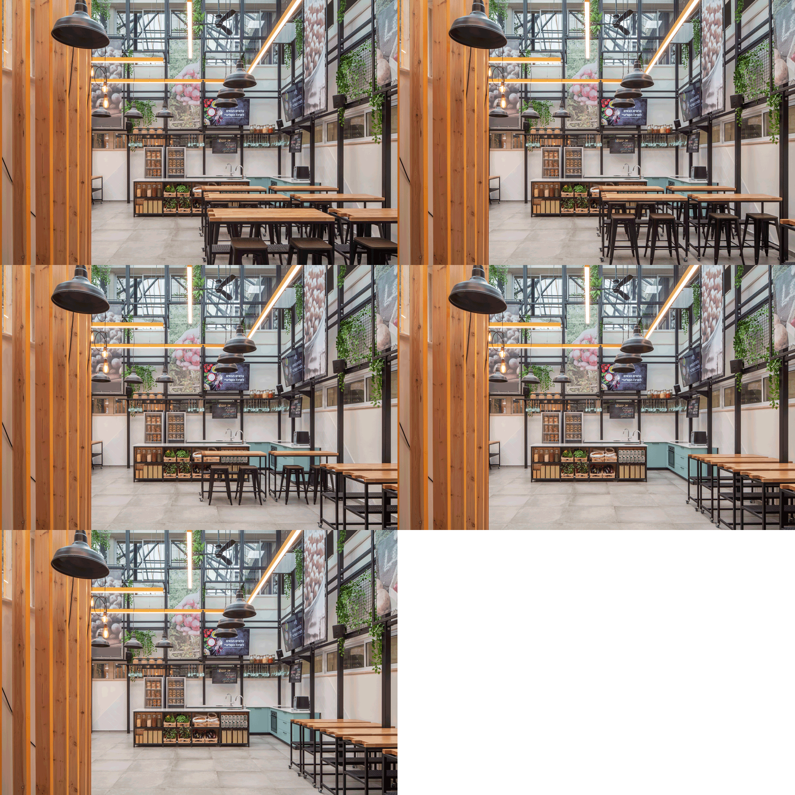
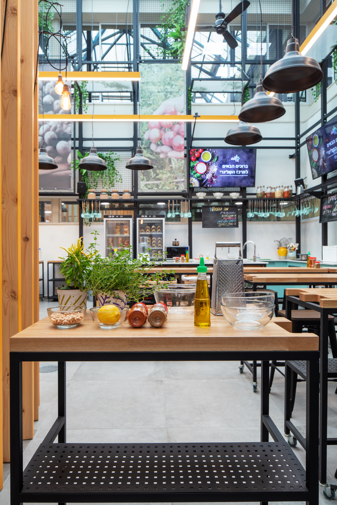
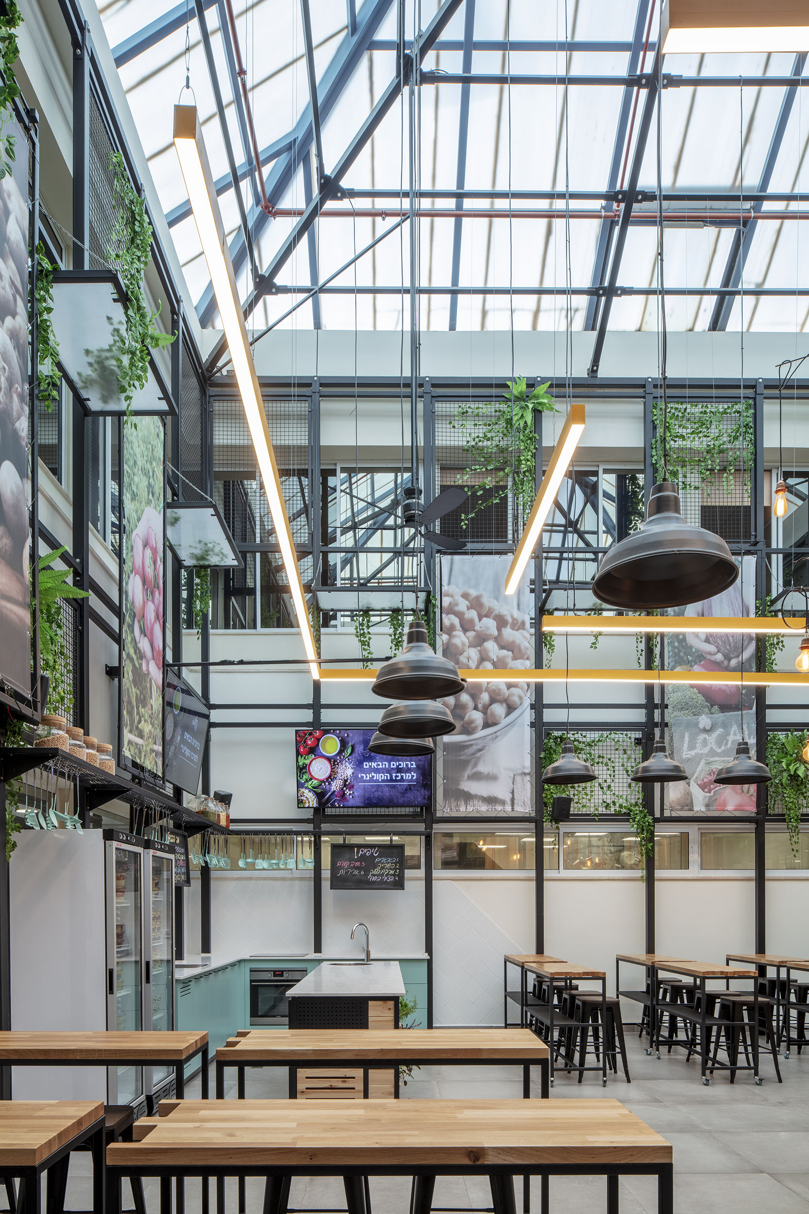
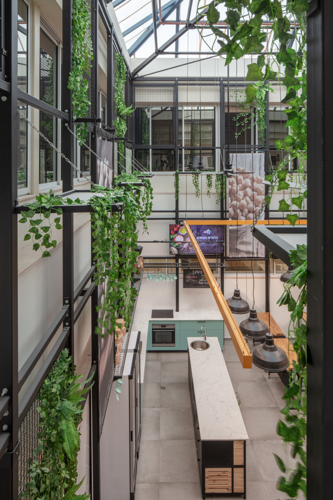
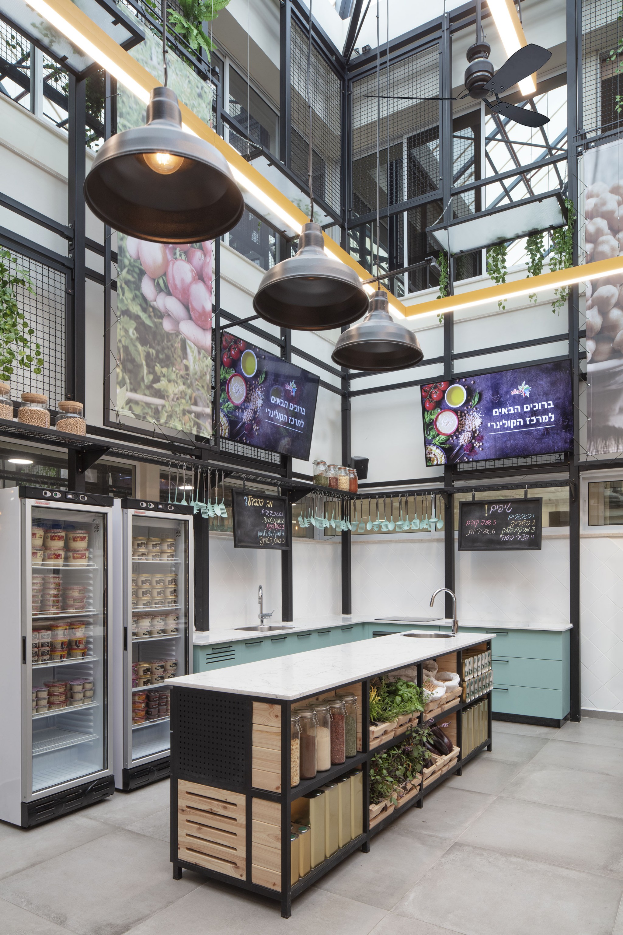
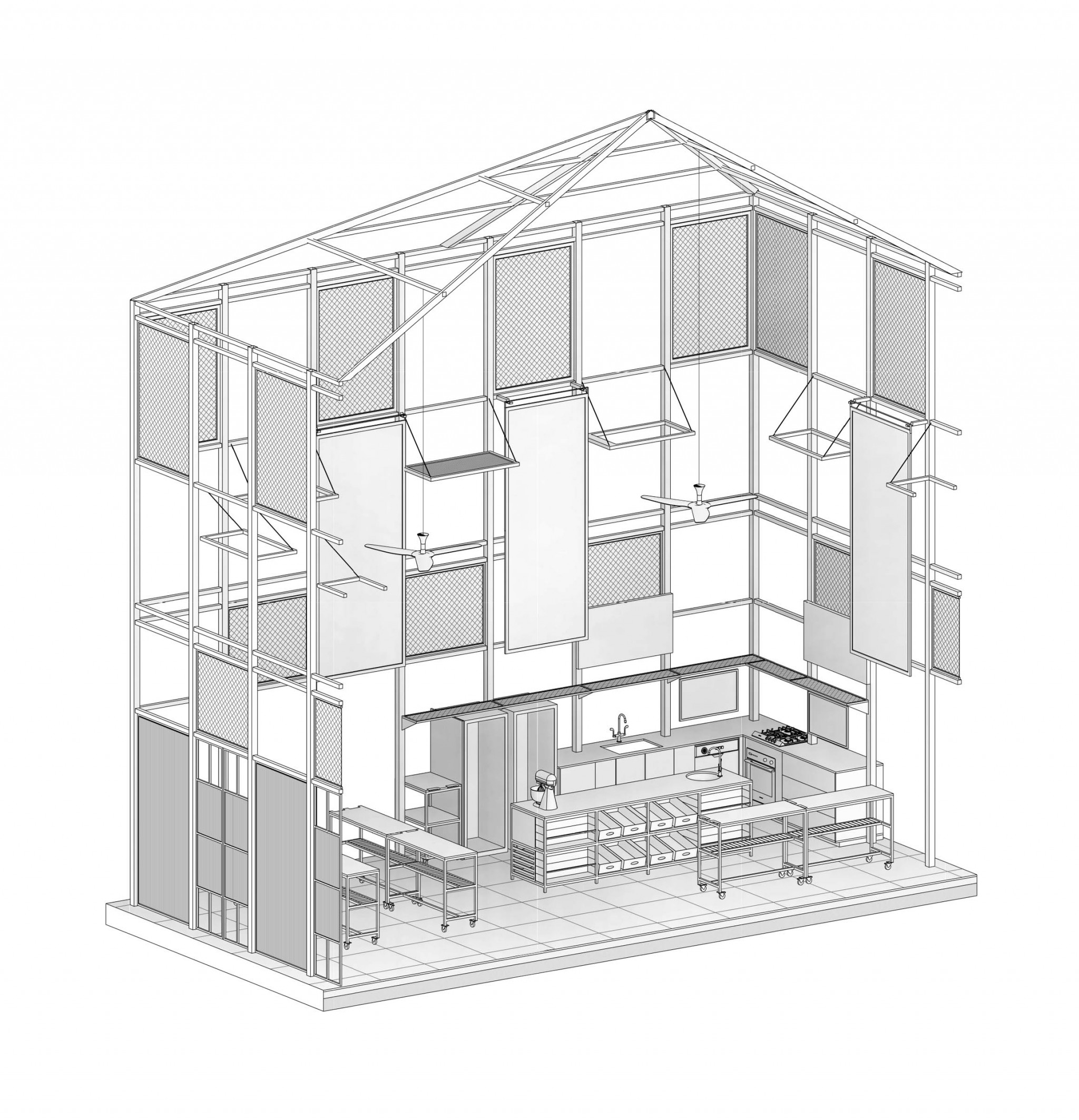
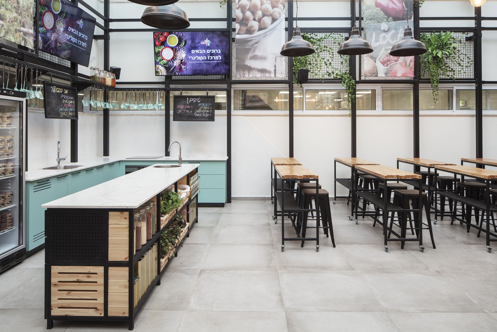
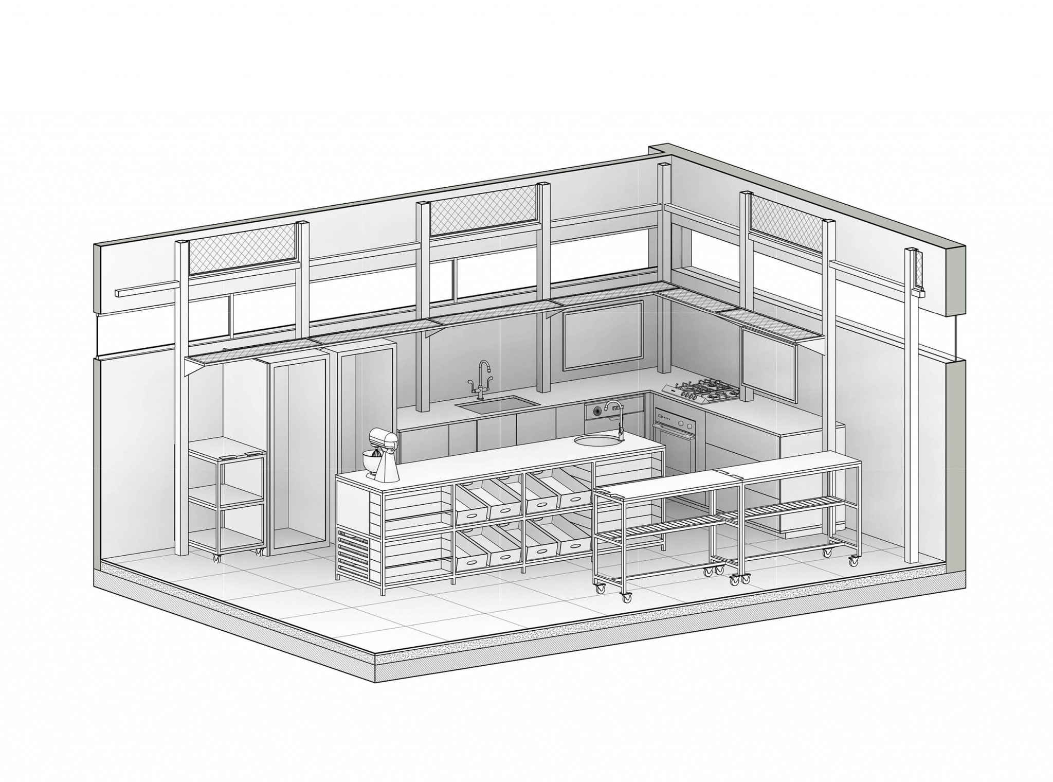
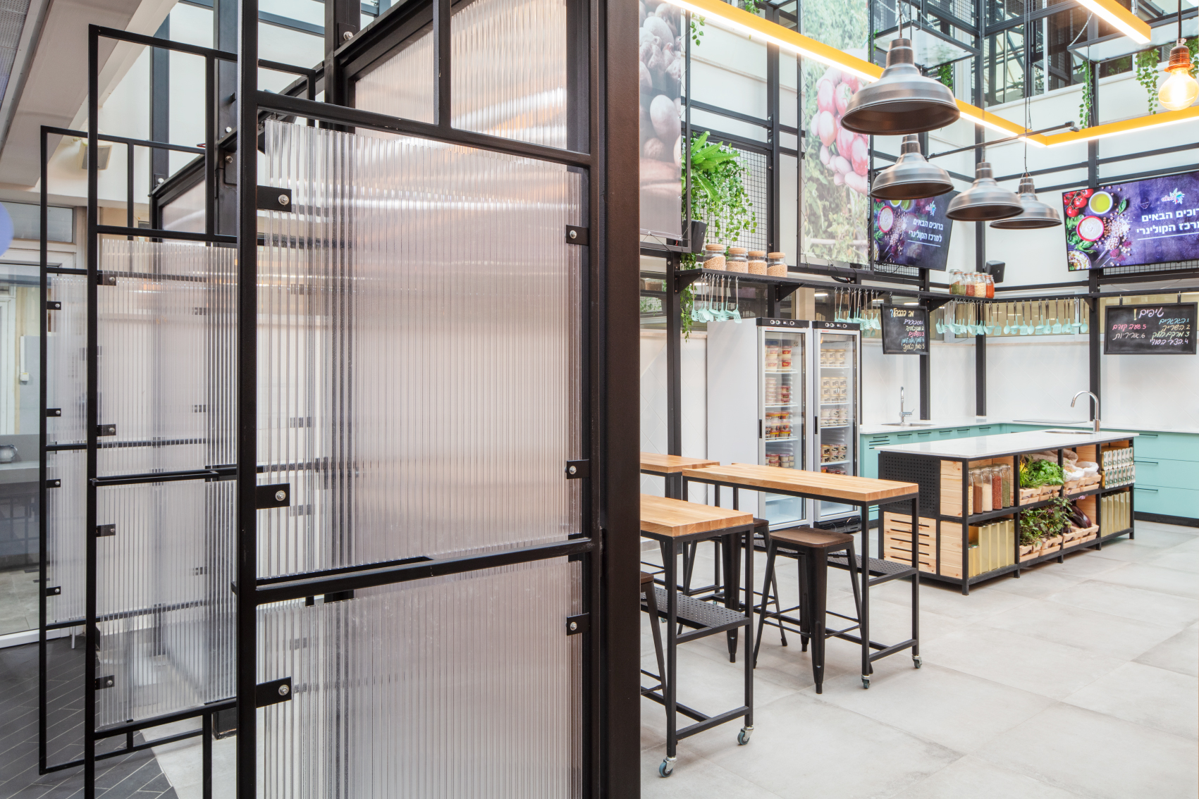
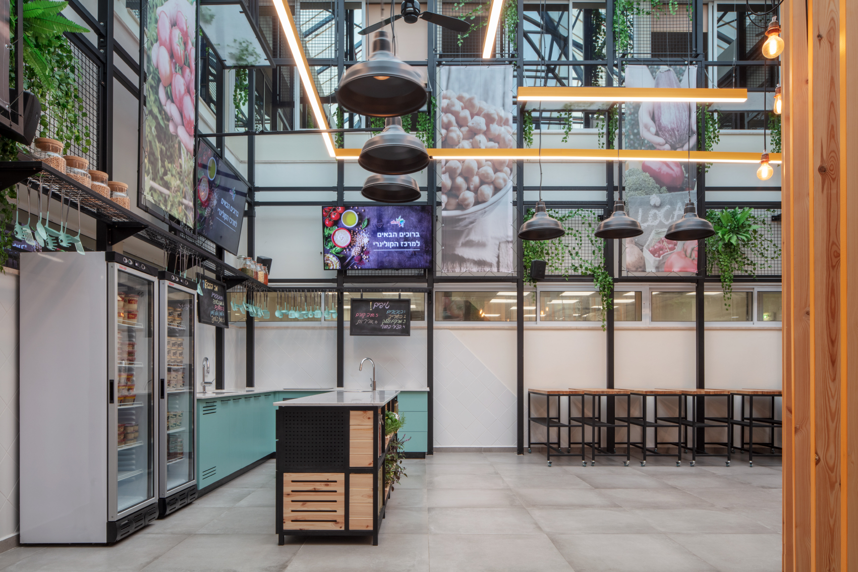
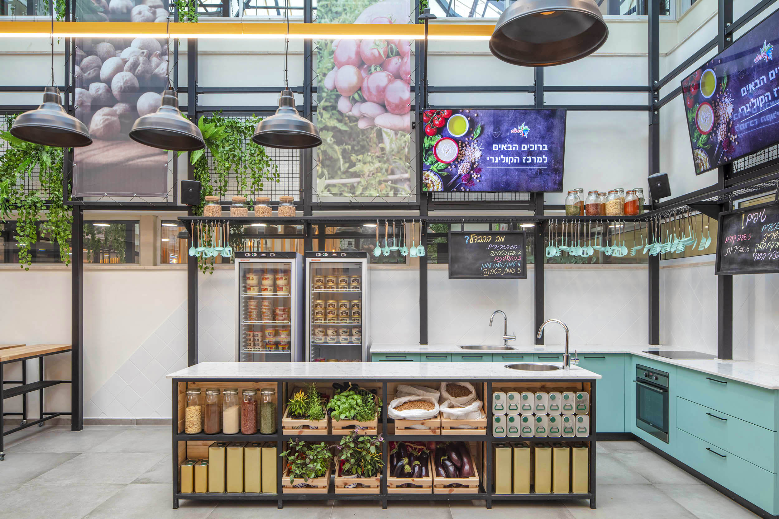
The values of the greenhouse,which was planned as a hummus makingworkshop, were consistent with the values of a vibrant,fresh, colorful market that combineswarmth and industry. We designed a light steel structure at a slight distance from the walls of the building to a height of ten meters, which reaches the height of the glass ceiling of the existing building. The idea was to magnify the values of the space of light and to turn it into a bright solar greenhouse. The steel framewas designed to blur the walls of the existing building and to divert attention to it as an independent structure that brings with it a new design language.
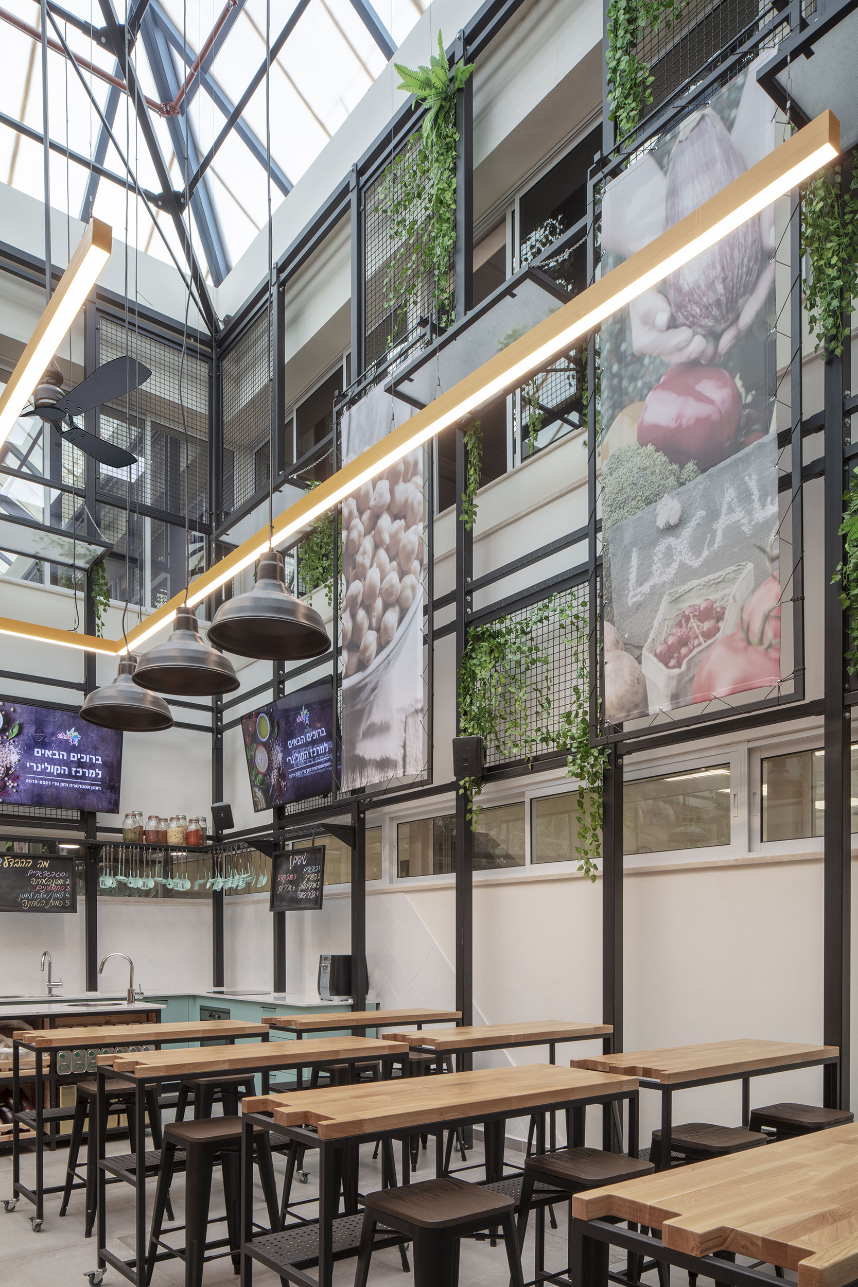
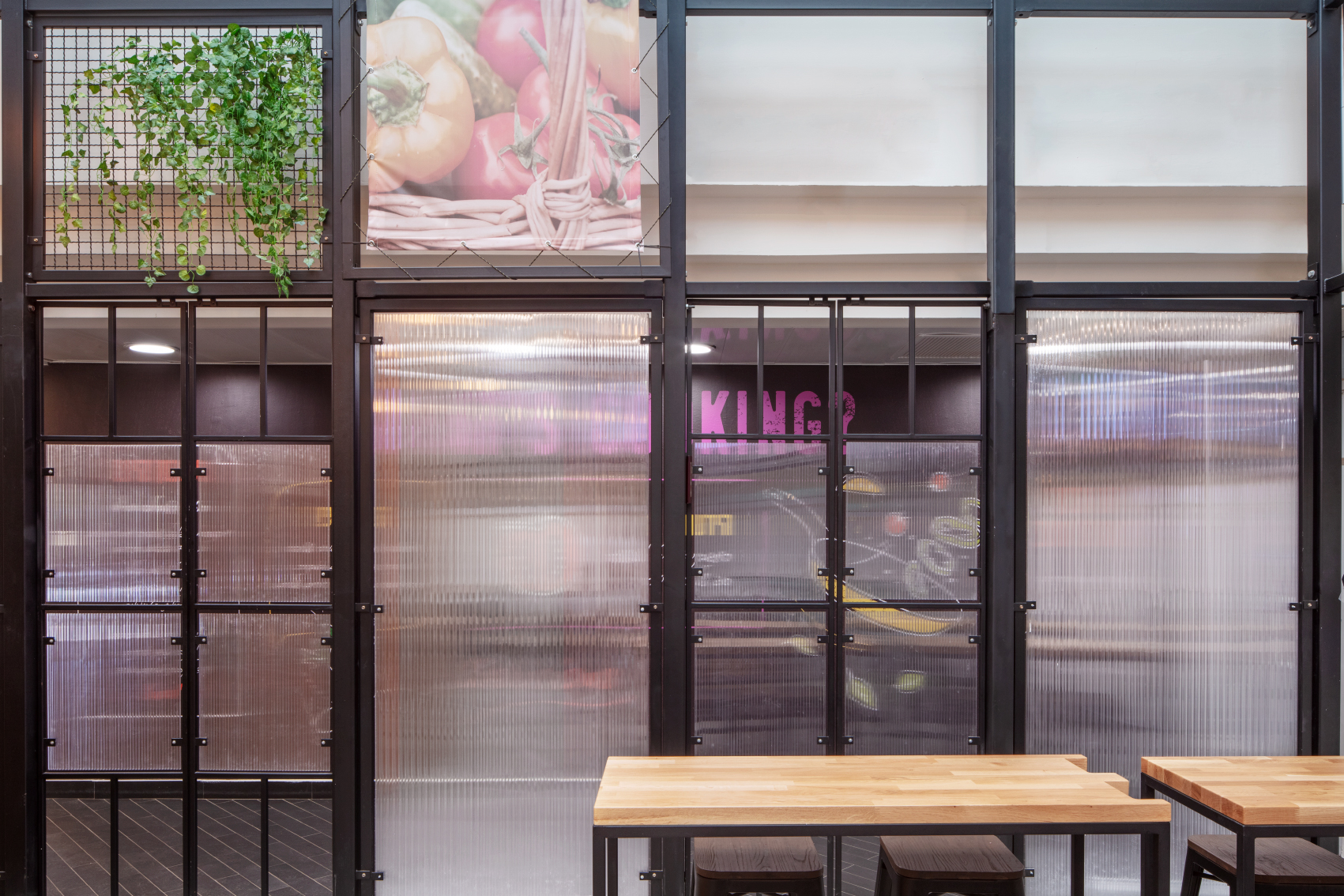
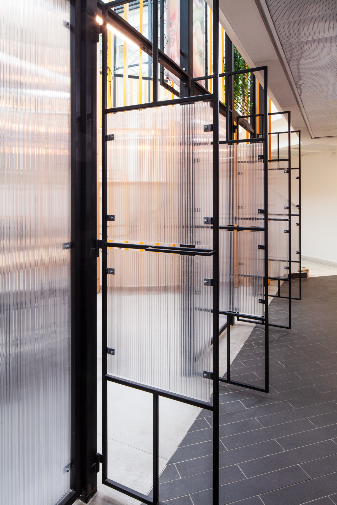
The greenhouse walls were designed as repetitive modules. Each module contains a different fragmentof material, together creating a fabric that embodies the values – industry, sustainability, and colorfulness – that we sought. The lower modules have translucent fiberglass surfaces that create a barrier between the passages surrounding the greenhouse and its contents. We designed three gates on two front walls of the light structure through which the workshop may be enteredand which allow for a more comfortable crowd flow. There is a module of square steel grids and open fiberglass windows covered withgreenery, and translucentfabrics which wereimprintedwith images of grain. The greenhouse roof is usedfor accommodating the light fixtures and fans.
Inside the greenhouse we have placed a steel island that also serves as a pantry facing the visitors, and behind it a rear kitchen. This serves as a workstation for the chef who directs and demonstrates the techniques used in the hummus workshop,while a ceiling camera photographs what is happening below and broadcasts it to the screens hung on the greenhouse walls.
We have planned dynamic steel carts for the visitors of wood and metal, which are workstations forhummus-making in pairs. The chairs are brought outof a small storage room below the top of the stairs.
